A close tonal match creates a quieter, more premium look. A darker or more contrasting grout can make a grid feel intentional and graphic, but it can also exaggerate layout inconsistencies when tile alignment is weak.
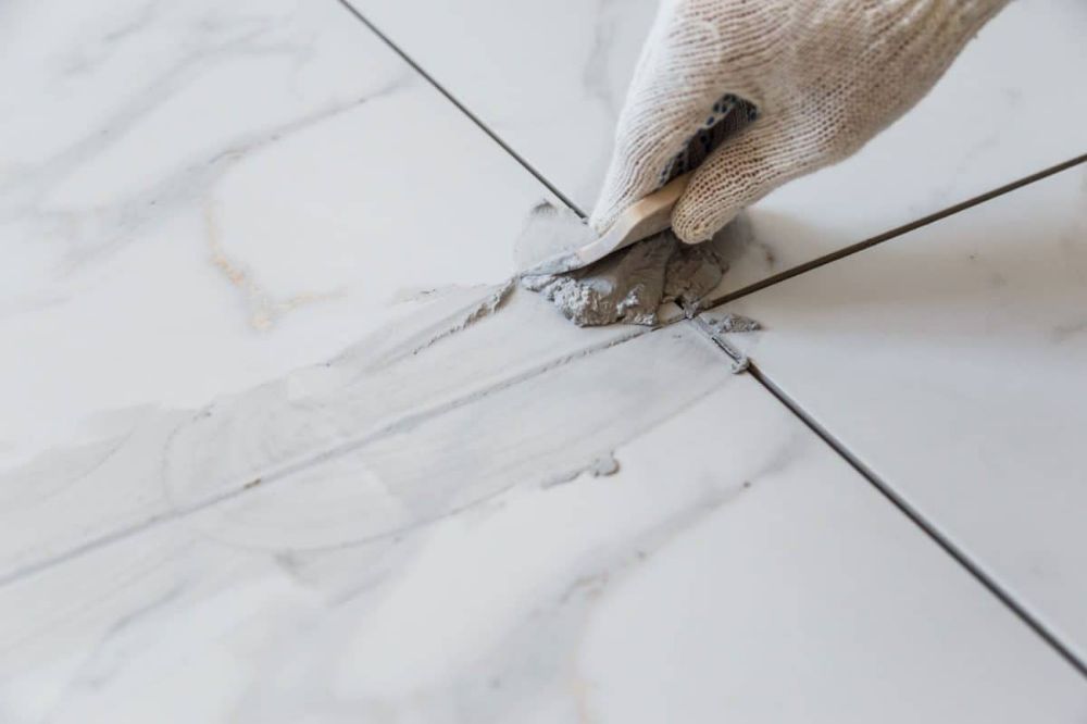
How grout color changes perception
Grout color can either blend the tile field into a calm surface or pull more attention to every joint line. That choice affects how clean, busy, premium, or decorative the finished wall or floor appears.
What joint width does to the final look
- Narrow joints usually create a cleaner, more contemporary feel.
- Wider joints become more visible and therefore place more attention on color choice.
- Even when the tile is the same, joint width can make the finish look sharper or more traditional.
When contrast helps and when it hurts
- High contrast grout can be a design feature, but it should be chosen deliberately rather than by default.
- If tile alignment or edge consistency is weak, contrast makes those imperfections more visible.
- Closer tonal matches are often safer when the goal is a seamless or premium appearance.
How to decide more confidently
Think about the tile finish, lighting, cleaning expectations, and the visual mood you want before finalizing the grout. A small sample review on site can prevent disappointment after the full installation is complete.